Transforming US politics with a voting platform for concerned citizens
A team of brilliant minds, made up of former soldiers from the US Air Force, molecular biologists, and Amazon economists, invited Boldare to build the app to energize citizens and gain valuable insights for policy makers.

Table of contents
Summary
POLCO team envisioned politics without the noise, with real-time polling, space for debate, and validated analytics. To achieve this goal, Boldare suggested an iterative approach to product design - from a simple prototype to full MVP, and then to a scalable app.
Cooperation was based on Scrum, providing a framework for a single team located in three countries, connected by Slack, Skype, Jira and GitHub. Everybody had just one goal - to create the MVP within seven sprints using the best design and development practices.
Following the launch of the MVP, Boldare has continued to collaborate on the release of a fully scalable product based on user and market feedback. Finally, a new in-house POLCO development team could take over further work on the app.
Client
The current world of politics and policy analysis is disorganized, unconnected, and inaccessible to most people. Meanwhile, policy makers have to spend big, polling their citizens to gauge opinions and even then spend even bigger to meaningfully analyze the data. Thus, a team consisting of individuals who worked at Amazon, Google, the US military and embassies, in the oil industry, at the White House, in banks, hospitals, and in public policy advice decided to create an online tool to remedy this situation: POLCO.
POLCO is a unique platform that allows people to vote, give their opinions, and comment on policies, while allowing policy makers to gather real-time feedback from citizens. The analytics tools within the app help political leaders in making the right decisions for citizens based on solid data.
Problem: the UX and UI are unsuitable for the business and user needs
Although POLCO had an exceptional and talented team, with vast experience in a variety of fields, they didn’t have an in-house development team. They had managed to create a prototype but they knew that in order to take the product to the next level, POLCO needed an experienced self-organizing team who could work on the usability and interface, as well as gather data, analyze, and develop the software iteratively. Nick Mastronardi, CEO at POLCO, realized that given the need to recruit, train and build such team in-house, time was not on their side. Company COO Alex Pedersen was tasked with finding a suitable partner company for the job.
User satisfaction is critical for activation and retention and so POLCO kicked off the search for a company not only experienced in delivering exceptional digital products but also with suitable design and development processes. Having worked at Google in the past, Pedersen knew the importance of processes and methodologies to delivering valuable, user-centered products. After careful consideration, they chose Boldare.
Solution: focus on key feature and iterative development based on real data
Tests and analysis as drivers for change
Polco had a lean startup approach to both the development of the app; a perfect fit with the way Boldare operates. Across the product development process, Boldare constantly adjusted the UX and made many pivots. The changes were driven by ongoing research and observation powered by a variety of analytics tools.
After completion of the first stage of the MVP, POLCO took the product to Harvard University students. They tested the app and gathered crucial usability data and interface feedback for over two months. Following that phase, Boldare analyzed the data and over two sprints, made significant changes to the product.
Finally, the MVP was released into the real world - the first test bed was Texas. The product kicked off in Austin and after that the app was launched in other cities. The team at Boldare observed how user behaviour changed over time, depending on the level of adoption of the POLCO app in a given city. For example, initial users tended to only read and comment, and only after a while were they ready to vote. This has significantly impacted the UX and UI.
The business goals: easy activation and retention
Boldare seemed to be thinking of things we hadn’t thought of before, which we appreciated. It’s been a good experience.
It’s all about two basic features: voting and comments
Before the Boldare team sat down to begin the design, they spent a lot of time getting to understand the business objectives and the target audience. Product Vision Workshops allowed the team to identify the key features on which Boldare has built the UX and UI, as well as a strategy for obtaining feedback from users.
The approach taken included specifically identifying the one key feature for the web app and similar for the mobile app. Work based on one key feature has a great effect. Firstly, the users know what goal the app allows them to achieve - there is no confusion about the purpose of the app. Secondly, it gives the development team a complete focus on building the interface according to one user goal. Finally, the investors can properly assess idea validation.
Obviously, the digital products have many goals and many features but choosing the single key features for web and mobile allowed the company to focus on priorities.
Basic feature 1: Simple voting
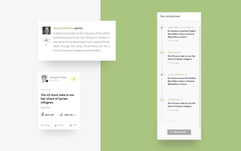
Easy access to the policy shortcut allows users to quickly understand the problem.
Basic feature 2: User comments
Every opinion is important in the context of other opinions - users see recent comments in the timeline.

Easy to use UI for a broad target group
Building the application for such a wide-ranging target group should be based on covering the full spectrum of users’ internet usage awareness. However, this does not change the fact that it is good design practice to choose one “user persona,” which in this case was the “user of the future”.
Filterable list of items
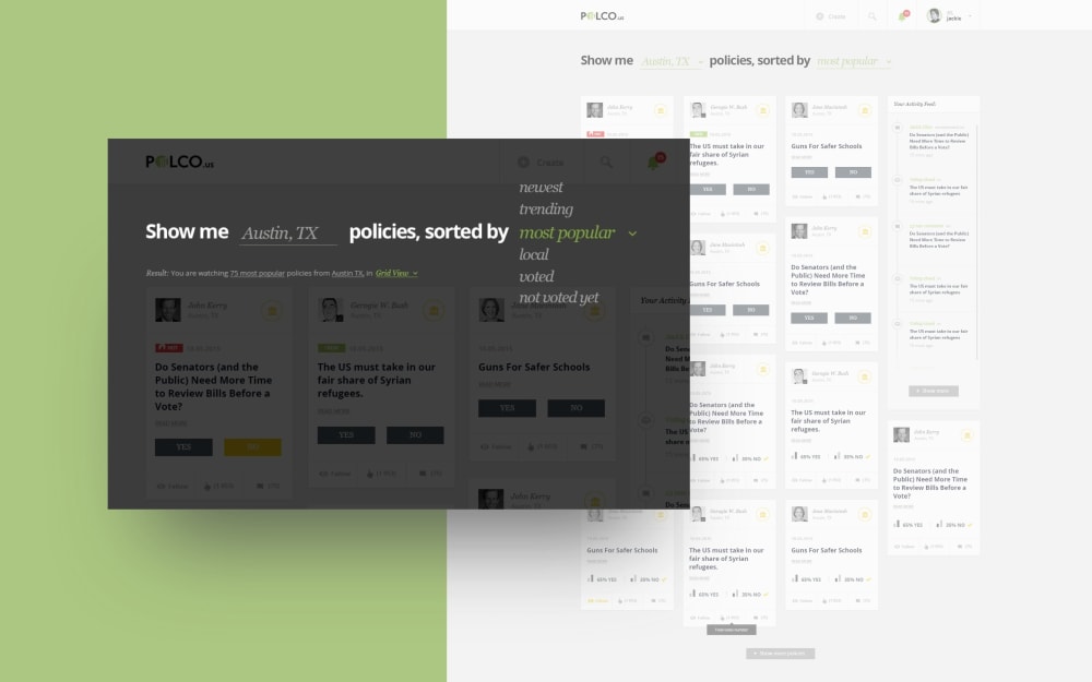
Maintaining the user’s interest and their sense of commitment is achieved by offering simple access to a vast number of policies.

Easy sharing
Public policy requires special attention in order to be available everywhere, to everyone. The design made sharing simple, based it on the most popular users’ actions in the USA.

The design process
“We liked their style and design but what’s been awesome is the process that they go through.”
The product designers at Boldare are involved every step of the way, from Product Vision Workshops through moodboards to architecture, wireframing and finally graphic design as well as implementation, testing and iterating. They work side by side with developers and business analysts from the very start to help deliver the highest value to the end-user and fulfill the business needs of the client.
Moodboard to save you money
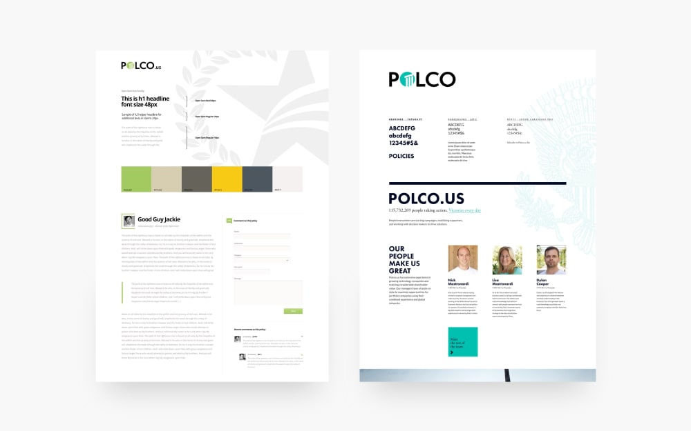
A moodboard is Boldare’s first stage in the design phase. It is a set of associations, colours, shapes, fonts, and styles that gives a general overview of the visual direction. Just one quick view and a four-second decision - like it or not. The moodboards are built on data gathered about the users. They are also quick and cost-effective way to gather first feedback. Finally, they give the designers guidance for further development of all graphic elements of the product.
Earlier activities, such as Product Vision Workshops, are focused on building the basics, understanding business objectives, shaping the structure and connections. The moodboard is Boldare’s first conversation with every client about about the design. Usually, clients receive 2-3 different moodboards to choose from.

Wireframes as guidelines
Wireframes are a communication tool both with the user, as a visible foundation of the user experience, and with the client, as a basis for discussion about project priorities before the graphic design phase. Work on the information architecture is represented visually and through actions (with clickable wireframes). For POLCO, the team decided to wireframe all views in each of the resolutions with the “mobile first” model as a principle.
Smooth user flow
Boldare team aimed to build a flow which achieved both business objectives (the actions you want visitors to take on the site) and user objectives (the desires or needs that they want to satisfy). The team planned all paths of acquisition (organic search, paid advertising, social media, email, direct link), activation, and retention, all the way to the actual conversion which, in the case of POLCO, is the voting.
Most importantly, the target user’s objective is to gain a better knowledge of the laws that affect him or her, better representation in government, and the ability to shape the local community. To reach this objective, the user needs to find out what laws and policies affect them, learn about those policies, engage in a discussion about the best decision, and express their opinion in the form of a vote.
A complete business environment
POLCO products include websites, widgets, and apps. Each of these allows municipalities to collect citizens’ views concerning proposed legislation and even notional agenda items. Citizens become more active and informed participants in the political process by voicing their views to municipal leaders and other citizens. POLCO makes expressing opinions and analyzing results accessible, easy, and convenient both for the legislators and voters.
Website design
Internet presence connected with marketing goals and brand identity. Quick and simple information about the app and its mission.
Application design
The app is the central point of users’ community building.
“There is an unbelievable amount of transparency and organization.”
Technology
Three time zones, one team with a single Product Owner on the client’s side. This is not only possible, it can be effective and really boost project creativity. The “small things” which are needed to achieve this are an incredibly clear process, a scrum framework, an interdisciplinary team, and relevant experience.
Variety of frameworks
Identifying the drivers of the front-end development was quite easy: performance, API connection, and time limitations. We needed something simple and future-proof at the same time; namely, Angular.js, javascript, and HTML5.

Results
The POLCO website and mobile app have gone through all innovation stages - from prototype, through MVP to a fully scalable product. At each stage, the team has managed to improve the UX and UI to meet business and user needs, while maintaining the high quality of the code. Currently, POLCO has over 46 active communities in the USA, which accounts for over 13.6 million people, and is expanding to other cities across the country.
The iterative delivery allowed POLCO to manage their budgets wisely and Boldare to achieve the right results for the client.
“They were not in any way trying to slow their hourly rate. In fact, we had so much at the end that we were able to add functionality.”
During the collaboration with Boldare, POLCO managed to grow an in-house team with designers and developers, who are now taking POLCO forward into its next stage of evolution.
Share this article:


