What is mobile-first design?
In the past, software was designed with desktop computing in mind, with mobile access seen as an extra or add-on. But these days, with almost 60% of web traffic worldwide being via a smartphone or other mobile device, designers and developers are increasingly taking a mobile-first approach. This article provides an overview of mobile-first design, what it is, the differences between mobile-first and responsive design, and the key elements of the mobile-first design process.

Table of contents
What is mobile-first design?
Mobile first is an approach to web and app design that places users of mobile devices at the center of their approach to development. As the mobile proportion of users continues to increase, designers are focusing on mobile devices as their ‘primary platform’ for digital products. This means the whole product design process is done with the small touchscreen in mind, followed by adapted versions for desktops, laptops, and other ‘large screen’ devices.
It all started – or at least, the use of the term “mobile first” started – in 2010 at the Mobile World Congress in Barcelona when Google CEO Eric Schmidt stated that designers should adopt a mobile-first rule in their work.
This makes perfect sense, not only because of the increase in mobile users, but also because designing something ‘small’ and then later expanding for a larger setup is more logical, and arguably easier, than the other way round.
Mobile-first design vs. responsive design
As our article “Designer’s tips on making your mobile UX design as good as the desktop one” from 2020 says:
…there’s nothing worse than opening an application or a website on a mobile device only to discover that its mobile version is unusable.
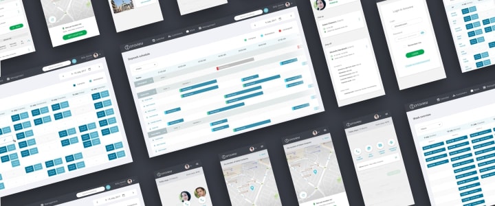
Two years ago, this was a relatively common situation. The usual approach to web design (often referred to as ‘responsive design’) was to create for a desktop environment, then adapt it for mobile use.
Naturally, designers starting with the desktop would make the most of the greater amount of real estate available, both in terms of screen size and processing power. For a mobile setup, responsive design often meant reorganizing formats and layouts and simplifying functionality and interface controls. The result? The mobile design would feel like a reduced, second-tier version.
This desktop-first approach of scaling down for mobile devices is also called ‘graceful degradation’. The downside is that various web elements do not adapt well to smaller screen sizes, resulting in a poorer visual appearance.
Mobile first design, on the other hand, is also referred to as ‘progressive advancement’. The key difference is that with mobile-first, designers are approaching the app and its environment with more of a blank slate, encouraging open creativity. With desktop first, by the time the designers are working on the mobile version, the creativity is mainly focused on addressing obstacles and challenges and building a product version that… does less.
It’s a question of perspective:
- With desktop first, you create a website or app, and then have to ask, “What features/elements must we lose?” (resulting in a reduced user experience).
- With mobile first, you create a website or app and then ask, “What can we add?” (resulting in an expanded user experience).
Adding new features will always be easier than taking them away, which is where the advantage of a mobile-first approach comes from. Finally, on a very practical note, Google’s search algorithm favors mobile-friendly websites. Arguably, mobile-first design is an SEO tactic considering that since 2019 Google’s algorithm relies on mobile-first indexing (source).
Why is mobile-first design strategy becoming more popular?
Apart from the fact that more people now access the web from a mobile device, mobile-first design is important because of the following considerations :
- As of May 2022, there are more than 3 billion smartphone users in the world.
- People spend an average of 3 hours and 15 minutes on their phones each day.
- People check their phones an average of 58 times each day (source).
It’s clear that the smartphone is the default method of accessing the digital world. It only makes sense to design with mobile in mind, rather than treat it as an afterthought.
Mobile-first design strategies and best practices
What do mobile-first designers actually do? What makes a mobile-first development strategy? In no particular order, the key elements of mobile-first design are as follows:
- Keep the process user-centric – Of course, customer centricity applies to whether you’re designing for desktop or mobile, but here we’re talking about mobile users. Bear in mind what design features will be relevant to them, make their lives easier, and solve their problems.
- A hierarchy of concise content – With a smaller screen size, keeping content to the point is essential. Content should have a clear order of importance, often with titles at the top with a preview option. The goal is to make it clear to the user what is available and where, without overwhelming with detail or volume.
- Clear CTAs – Calls to action should be consistent in design, hard to miss, and easy to click.
- Avoid pop-ups– On a mobile device, pop-ups are more than just potentially irritating to the user, they can block out most or all of the screen… another reason for users to cut short their visit to your site.
- Think about loading speed – Slow-loading websites lose visitors fast, and by “slow” we mean anything over three seconds. To reduce loading speed, cut out anything unnecessary, compress images, and use ‘lazy loading’. It’s a technique in which website elements (other than its main content) load sequentially, according to their importance.
- Carry out testing in real conditions – Usability testing is an essential part of any digital development process and checking your design with real users, in real conditions, is the only way to know if you’re achieving your mobile-first design goals and identify priorities for improvement or enhancement. Testing should be done on multiple platforms, devices, and browsers.
Above all, follow the KISS principle and keep things simple. Design your site with the minimum number of pages necessary, and with a maximum of two columns of content (one is better if you can manage it). Think about typography – what is clearly and easily readable on a large desktop or laptop screen may cause squinting and eye-rubbing on a mobile device. Use white space to give page layouts an uncluttered look. Also, information architecture can be an issue, so design your app or site with only the most essential links.
The future is mobile-first design
In fact, as we’ve seen, the present is mobile-first, but given the direction of the statistics around web access and use, mobile-first is a strategy that will only become more popular, and more essential. It makes perfect sense for digital designers and developers to focus on the needs of the majority user group and prioritize mobile-first development strategies.
But the basic design goal stays the same: create the best possible user experience that also meets the product-related business needs. The difference is, more and more of those users will be experiencing your app or website on the move.
Share this article:


