Designer's tips on making your mobile UX design as good as the desktop one
Let’s be honest, there’s nothing worse than opening an application or a website on a mobile device only to discover that its mobile version is unusable. The awareness of the business benefits of mobile UX has grown in recent years visibly, but still, there are a lot of mobile web apps with questionable or simply poor usability. So what are the common mistakes that have a negative impact on the user experience when designing for a mobile? What elements are the most problematic ones and how to convert desktop apps to mobile without losing their quality? Read on to see real-life examples I dealt with personally.

Table of contents
You can be sure that the product designer did a good job when the transition between using the desktop and the mobile is seamless.
Consistency is a fundamental design principle that eliminates confusion, though the mobile shouldn’t be a copy-paste version of the desktop. When designing for the mobile, designers need to consider how to transform web elements so that they are user-friendly – easy to understand and use.
This means that responsive web design (RWD) isn’t about reordering stuff, therefore it doesn’t mean that three images in a row on the desktop will be placed vertically one below the other on a mobile screen. While designing for the mobile, we aim to create an experience that is different from desktop creation, because its context is completely different.
Of course for us, product designers, the ideal situation is when we can start with the mobile-first approach, but in fact, it doesn’t happen very often. Why is that? For instance, the mobile-first approach doesn’t work if we already know that at least 80% of user scenarios describe a desktop context and this is when the desktop-first approach is a better choice. Another case is that many clients want us to design a mobile version of their web app that already exists. Nevertheless, we are faced with optimizing web apps for the mobile UX on a daily basis and below I’ve pointed out a few crucial things to take care of when designing for the mobile.
1. Content prioritizing
You might have heard that people like to scroll. Well, that’s how they scan the content, but they will surely lose their patience if they will be looped in endless scrolling in search of specific information on their mobile device. That’s why the content for the mobile should be responsive to the user’s current situation. But what does it really mean?
When prioritizing content, we think about the users’ needs. We need to find out the context in which the user may want to use the app on the mobile device – not desktop this time. It’s crucial to determine how, when, and where they will eventually interact with the product. Let’s take a restaurant – if someone is opening a restaurant’s website on their mobile, it’s very likely that they’re hungry and maybe even on their way somewhere, so probably they only want to see the menu or book a table as soon as possible. More detailed information like the ‘About’ story and so on might be hidden behind the menu or some accordion – at that very moment, this is not so important.
This simple example shows that eliminating any element that isn’t essential for the user makes the interface more user-friendly. We know that clutter is one of the worst enemies of good design, especially when it comes to the mobile – every field, button, text, or image makes the screen more complicated.
2. Accessibility, reachability, and predictability
Now, once we’ve agreed (haven’t we?) that the less content the better, let’s dive a little bit deeper and think about accessibility, reachability, and predictability. To create a good mobile experience, we can’t just copy-paste desktop elements – we definitely should follow the visual style of buttons or controls, but they can’t be reused in the same form for the mobile. We have to remember that mobile devices are much smaller than desktops as well as they’re used in different ways, with hands and fingers instead of mouses.
In general, everything should be bigger on mobile web apps. Any paragraph smaller than 16 pixels is challenging to read on any screen. Speaking of typography, besides the font size, the important things are also font family and font weight. Users prefer a clear, easy to read font and they want to see what they’re reading, so it’s safer to get rid of ultra light fonts, even if they seem appealing. It’s also nice when there’s a typographic hierarchy so that titles and headers are easy to spot.
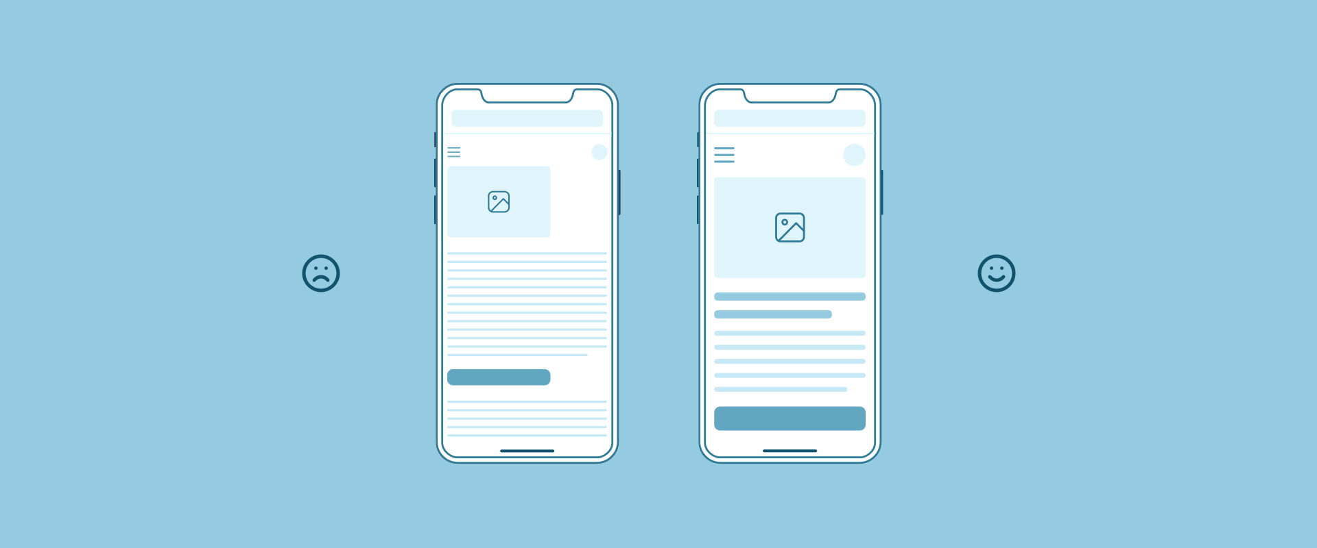
Another thing is the contrast, which is relevant for every single element of the user interface. We need to assume that conditions under which people look at their mobile devices are rather far from being ideal and high contrast can make the elements more visible even when the bright sun hits the screen. Other than that, a light text colour against a light background colour is always hard to read.
As I’ve mentioned before, designing for the mobile is designing for fingers, not cursors, so we have to make sure that clickable elements like buttons, dropdowns, or any other triggers are reachable for the user. Finger-friendly controls that are easy to tap measure at least 40 pixels (10-12 mm), however it’s not only the size that is important, but also the right amount of space between targets. If we have, for example, two buttons and one says ‘Continue’ while the other says ‘Cancel’ and they are too close to each other, they can be tapped by mistake, which can actually frustrate the user or even make them leave the website.
What’s also worth considering is the thumb zone. The bigger the display, the more of the screen is less accessible, while most of the users hold mobile devices with only one hand. What we’re taking from that is the good practice of putting the majority of interactive content, especially call-to-actions, in the so-called safe zone (see the illustration below) – the area that can be easily accessed with the thumb, while others require some inconvenient finger stretching.

And finally, we move on to predictability, which is of key importance for mobile devices. Unlike the desktop, where users can hover elements to get some help or understand whether something is interactive or not (which should always be clear at a glance by the way…), on the mobile, users can only tap and proceed further immediately. That’s why, for instance, call-to-actions should look like call-to-actions and their labels should be understandable so it’s obvious what they do or where they link to as well. When things work in the way users predict, they feel a stronger sense of control.
3. Forms and inputs
While good patterns for inputs and filling the data are another long story to tell, let’s just focus on treating them on the mobile. As we all know, typing on a small mobile screen isn’t the most comfortable experience, but there are a few solutions that make it easier and faster.
As the importance of the size is described above in more detail, I’ll just mention that it also applies to the inputs, which everyone wants to fill in the end. Other than that, the layout, especially of long forms, matters and it’s really a great convenience when fields come one below the other instead of being placed next to each other. Also, another great improvement is simplifying the forms by removing unnecessary fields, like merging two fields – ‘First Name’ and ‘Last Name’ in one ‘Full Name’ field.
What’s more, to make the process of filling forms smoother, we should specify the type of the inputs as well and customize the keyboard for the type of query. This way, for the email address field we can display a keyboard with @ symbol, for the field with phone number – numeric keyboard only, and for the date field – provide an easy-to-use date picker. Another good practice is prefilling the data in some cases instead of asking the user to type the same data twice.

4. Process visualization
If there’s a process within your app and it contains a lot of actions required from the user, it’s good to divide it into smaller steps. This principle is extremely important in mobile design because we don’t want to create too much complexity for the user at once – on one screen. It’s useful especially for e-commerce purchasing paths, registrations, or applying for anything.
Once the process is splitted, we need to show it properly. The users should have control over every step, which means they should know at a single glance where they are in the flow, what needs to be done there, what’s next, and how many steps are left to finish the process. We can achieve that by using a stepper at the top of the screen.
However, displaying steppers on the mobile is quite challenging due to the limited horizontal space. Applying the same linear stepper design from the desktop to the mobile may cause visibility and readability issues as it’s rather impossible to force all step titles to fit a tight space. To avoid visual noise and make it easier for the users to track the progress, the recommended solution for mobile web apps is using a radial stepper. It gives enough room for long step titles as it displays only the current step at a time, indicates the next one, and represents the flow progress in a visual way. Because of that, it takes only a couple of eye fixations to scan the radial stepper.

5. Accessible and easy-to-use tables
If you think there are no tables within your app, you’re probably wrong. We can see them, for example, on applications with admin panels (users list), e-commerce sites (cart or last orders list), or any financial apps. So now, how can we fit a wide table from the desktop to the narrow and vertically-oriented mobile screen without losing its purpose and readability?
There are several quite good ways of approaching that. The first one is to simplify the table by reducing unnecessary columns so it fits and still remains a classic table, but of course, there might be cases when the user context doesn’t allow us to drop any data. Then we can think about making the table fully responsive, where the data is visible without vertical scrolling.
How to achieve that? A good idea is to use swipe gestures to scroll the content, making the primary (legend) column fixed in one place at the same time, so that we don’t lose the context. A table in this form is handy and nice to use, but might be problematic if there are a lot of columns. That’s why a common, bulletproof practice for a huge amount of data is to transform the original table by putting the table rows into separate cards, placed one below the other with a possibility of collapsing them. All in all, depending on the needs, there are many ways to present your data correctly and attractively!

Mobile design is about solving challenges
As you can see, mobile design can’t be a 1:1 copy of the desktop version. While designing, there are many things to consider, but as presented above, there’s no doubt mobile UX design can be as good as the desktop one. Of course, creating good user experience for the mobile takes time, but simultaneously it can save it – investing in UX from the very beginning significantly reduces the product development cycle and increases the conversion rates as well. At Boldare, we’d love to take care of your mobile product!
Share this article:


