ERES Yachting - designing a premium online booking experience for luxury travel
If there’s a single thread that runs through any design process – or should – it’s the product user. In the case of ERES Yachting, their users choose from a selection of more than 13,000 luxury yachts in nearly 500 global destinations. When the time came to shift the booking process online, ERES Yachting was searching for a state-of-the-art experience based on a straightforward customer journey, wrapped in an upmarket package. Boldare was happy to comply.

Table of contents
This article is derived from a webinar titled, Designing a premium online booking experience for luxury travel, in which Boldare product designers Adam Chrobak and Paweł Capaja reflected on the ERES Yachting project and how the design approach was instrumental in delivering a highly successful product welcomed by the client’s users.
The bigger picture
It may be a cliché but it’s true: the world is changing, and so are the markets. In every industry sector, businesses are finding that digital transformation is real and happening. The line between products and services is blurring as our devices remind us, prompt us, and encourage us as we engage with digitally-enable businesses.
The travel industry was one of the early adopters of digital services, notably online booking, as shown by the now-classic examples of booking.com and Airbnb. The key to success in both cases was, and is, a clear and easy user experience and that was exactly the goal Adam and Paweł set themselves for ERES Yachting.
Step by step design
1. The heart of the process
Important for both product designers was a simplicity of perspective or, to put it another way, “The general rule in UX is not to overwhelm.”
Tempting as it may be to add more and more features, each more sophisticated and wonderful than the last, remember that the product is ultimately going to take their money so a better approach is to keep things simple and help them reach their goal as quickly and a smoothly as possible.
For this project, the initial focus was on the user’s ‘first contact’ with the system’s functionality: search and filter.
The search and filter function is essential to helping users find a yacht they want to book. It absolutely could not be over-complicated as both ERES and its users want to reach the point for booking quickly. And as the Law of Hicks says, “The time it takes to make a decision increases with the number and complexity of choices.”
The solution lay in striking a balance between offering useful filter options yet maintaining the ease-of-use of the search function, and wherever possible offering short cuts to booking, such as highlighting special offers and promotions which help the user reduce the options available.

2. How to talk about the products
Continuing the theme of keeping it simple, another key aid to use and user understanding is the information the system provides on each product option.
Once the user has found a possible yacht via the search function, they need to know more about how it will meet their needs (or not). They want to be assured of making the right choice and any difficulty at this stage can be a dealbreaker.
For the designers, this means laying out the yacht’s characteristics in a format that is easily found, read and understood; preferably followed by a booking call-to-action.
3. The ‘crunch’ – the booking
The user has found their ideal yacht, all that’s left is the booking itself but… the project is far from complete; a painful booking process is often enough to change a buyer’s mind and by this stage, you need the user to trust you because they’re about to part with their money.
The core values Boldare’s designers kept in mind here were transparency and predictability. There should be absolutely no surprises when the time comes to book, so every price and cost is stated clearly, leading to a final total that by now is exactly what the user is expecting; including applying any offers, vouchers, etc.
4. Feedback is the key
No, not feedback from the user, but to the user. Throughout each stage of searching, deciding and booking, the system is designed to give feedback to the user, confirming exactly what they have done, and what must be done next.
Messages are short but complete and designed with two purposes in mind: to move the user on to the next stage of the booking process, and to reassure them that everything in the transaction is going smoothly (or, if it isn’t, what they need to do to get things back on track).
The user interface – getting it just right
That was the design process followed by Boldare’s team but how does it look and feel from the user’s perspective? The answer depends on the user interface and for ERES Yachting, the goal was a luxurious interface for an affluent audience. With that in mind, Adam and Paweł selected two design techniques best-suited to the project, from the Boldare toolkit.
1. Product Persona – Knowing who you are designing for is a fundamental starting point. In fact, one of the most important steps of every Boldare project (during the initial client workshop) is the creation of the ‘product persona’.
This is an imaginary character that will use the product, often based on real persons, consultation or market research. This imaginary user then serves as a reference point for the designers, checking the necessity of specific design features against what the product persona would like or use.
A product persona is defined by a wide range of demographic data, including personal information, social activities, work behaviors, income and assets, preferred technology, and so on. For the ERES Yachting project, the product persona was, “a reasonably rich man, over 40, with family, and a love of traveling, sailing, and nature”.
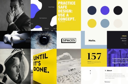
2. Moodboards – When deciding on the look and feel of a product, a moodboard is an incredibly useful method of presenting the client with snapshots of images, colors, and fonts that give a taste of what the design could be. For ERES Yachting, the team crafted three different moodboards for the client to choose from, each a different interpretation of the agreed design brief.

The secret ingredients: Teamwork & Communication
Boldare is not structured in departments according to function, such as ‘design’ and ‘development’. Instead, a unique team is created and allocated to each project. This keeps the various elements of the design process closer together and allows for rapid and direct communication between collaborating team members, even when that communication amounts to hundreds or thousands of messages over the project life.
The team also includes the client, in the shape of the Product Owner role, and the principle of fast, transparent communication equally applies to them. Not only is the Product Owner included in essential discussions, they have open access to every question, conversation, and agreement within the team, whether they were personally involved or no.

The final design
The final booking platform was based on the design brief, client input, research, and of course, the agreed product persona and moodboard.
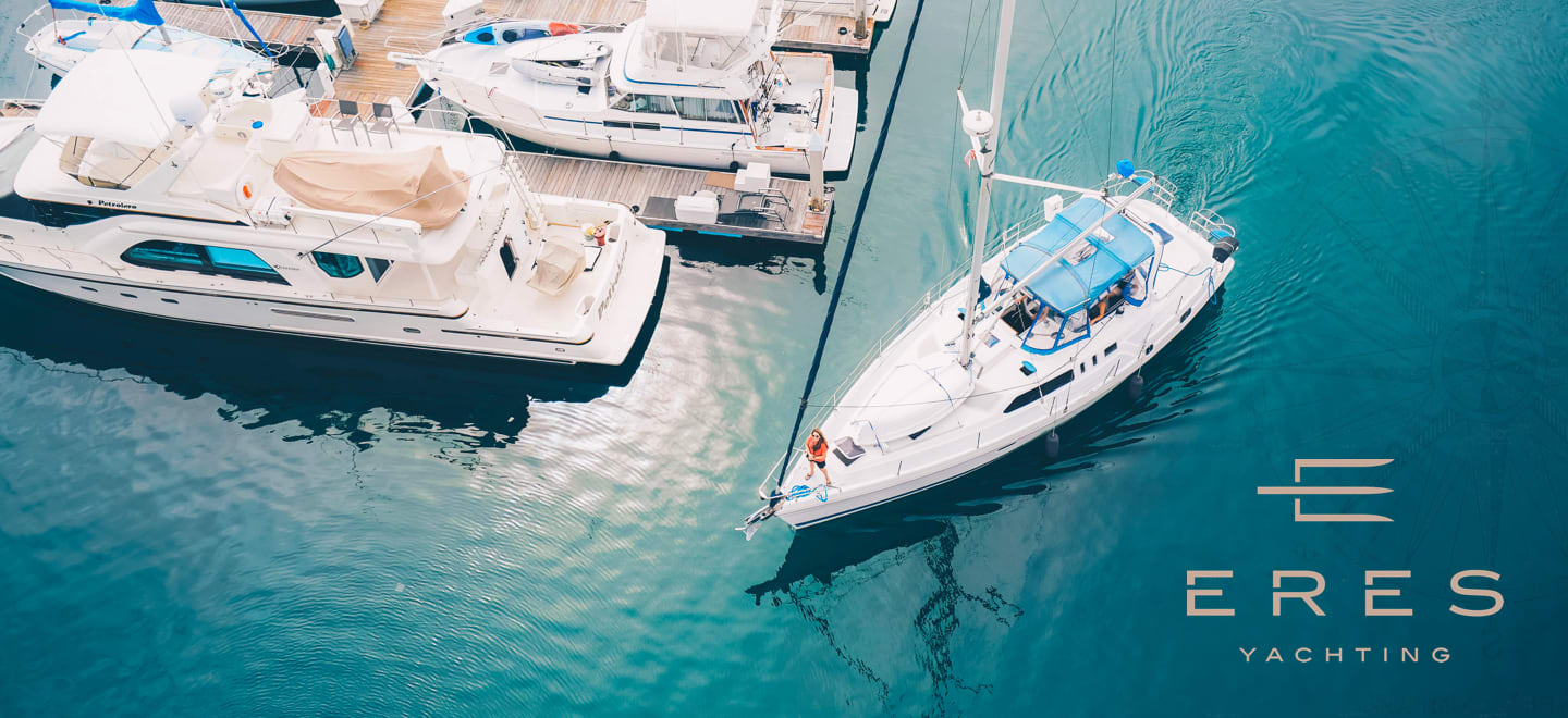
Enjoyment of yachting is closely related to feelings and experiences, so the interface design reflects just that, using high-quality marine photos and details, and light, sophisticated fonts.
For the color scheme, they used subtle tones and elegant gold detailing. The other very important factor was the use of specific language tailored to the target user.
The result? The feedback indicates it is a high-end luxurious interface for an affluent audience, with a completely fresh and attractive style.

Designing a premium online booking experience
Boldare’s design team were faced with a challenging and highly specific brief: to create an online booking platform to appeal to the luxury leisure demographic.
With simplicity as the key, the team broke the user journey down into its component stages. Each stage received its own design focus, with the goal of a rapid but reassuring booking process. Tools such as moodboards and a product persona were critical in ensuring the finished product met the needs of both its target audience and the client, ERES Yachting.
>>> Want to learn more? Check out:
Share this article:


