10 pro tips on how to create an award-winning website in 3 weeks
At the beginning of 2020 there were 1,744,517,326 websites globally. Everyday, over half a million websites are created adding to this vast online catalogue. How can you make sure that a website promoting your products or services will stand out from the crowd? Here at Boldare, we have the secret - it’s a design guaranteed to amaze your customers and get them talking about your brand. We also believe that we cracked the code and discovered a recipe for an award-winning website creation process that is rapid and highly cost-effective. Below we describe our process and share pro tips from our award-winning team. Read on!

Table of contents
Our award-winning background
Let’s start with some facts - why do we believe that we’ve discovered the perfect recipe for award-winning website designs? Since April of 2020 our marketing team has won 5 different international design awards for two of the websites we created.

The Explore Chartipedia landing page we created to promote the Chartipedia community platform (that was developed by one of our dedicated scrum teams) won the following accolades:
While our newest project, a landing page for our online collaboration app, Boldare Boards won, just a few weeks after the launch, the following awards:
- Honorable Mention at Awwwards
- Mobile Excellence at Awwwards
- CSS Reel
- CSS Winner
I will use an example of the latter website to explain and visualize how we fine-tuned our processes into an award-scooping machine.
10 professional tips for designing an award-winning website
So what is the recipe for an award-winning website design? I’ve gathered some pro tips that might be useful for product owners and other stakeholders when working with your in-house or external development teams.
1. Keep the focus on the business goals
The team has to be aware of what they’re aiming for. It’s very easy to get lost somewhere, and this is why business goals for your website, or any other digital product, are extremely important. They are the inspiration at the conception phase, a beacon for the team when making tough choices, and the true measurement of success.
For this project we wanted to achieve two major business goals:
- We wanted to repeat the success we achieved with creating the About Chartipedia landing page, and win the most important design awards again using the newly created landing page. These successes are helping us with marketing campaigns that are fueling our lead generation efforts.
- Boldare Boards is a result of merging two parallel tools - our internal Boldaretro, and public Sprint Retrospective Tool. Unification of these two apps was aligned with a major update of the tool. Our secondary goal was to highlight the refreshed designs and new features of Boldare Boards by presenting them on a new landing page and, as a result, increasing our brand visibility and its significance.
These two goals were with us from the very start till the end of the project and were reflected in our choices on a daily basis. For example:
- When deciding how much time we want to invest in the project, we knew that it couldn’t exceed 3-4 weeks, otherwise we wouldn’t achieve a positive ROI on the lead gen campaign.
- When deciding on the creative direction of the website, we focused heavily on the first goal and chose a very bold direction that would work well for the design community and awards juries. For example, it would be natural for UX/UI designers to put more effort into making our website more accessible, taking into account UX requirements. But our goal was to amaze a community that sees dozens of great websites every single day. And we had to focus more on making them say “WOW” instead of polishing interfaces and making our site more accessible.
- When deciding whether we should add a new section to the website or spend more time perfecting the animation, we chose the latter to fulfil our award-winning business goals.
- Finally our success metrics were based on these two business goals - Have we won the awards? How many leads did we generate? How many people have we reached with this brand awareness activity?
2. Work only with the best talents
Even with step-by-step instructions on how to create a great website, you won’t get outstanding results with a mediocre team. It’s painful, but this is the reality.
When we started selecting our talents for the task, we were looking for a very particular skill set:
- Two frontend developers who are up for the challenge of working in a new framework (Vue.js in this case) within a very limited timeframe.
- Creative designer that can create a unique vision, and an experienced product designer to keep the structure and UX at an outstanding level.
- Two content writers - one who specializes in web copy, and another focused on UX writing and microcopy.
- A scrum master who will help to maintain the processes and guide the team to the goal.
- We also used QA engineer support on demand.
According to our estimations, we needed three weeks to design, develop and launch a website, and we delivered on time. Most of the team selected for this task was responsible for the success of the About Chartipedia landing page. This way, we were taking advantage of a well-knit team that had a history of working together on a daily basis in similar configuration and projects.
We are happy to have the best experts on the market. If you can’t access them in your company, regardless of the reason (limited talent pool in your city, lack of HR and hiring processes, tight budget, etc.), seek for them outside of your organization.
3. Don’t separate developers from designers
Communication and collaboration is absolutely crucial for every digital product. Especially when you need to operate within a very limited timeframe. They need to have space to chat and discuss freely and share their ideas and challenges. It pays back later!
For example, at Boldare, software developers are engaged in the creation process from the very beginning. They’re involved in the opening workshops when the team discusses the main goals and works on the initial design concepts. Thanks to that, when they can finally start their software development tasks, they’re perfectly aware of the business goals and other product aims. This way, the whole team is on the same page at every phase of the project. And this was the case this time for Krzysztof and Tomasz, our frontend developers.
They didn’t wait for the final version of the designs to be delivered. Instead, each piece of design that was provided by designers using Zeplin was immediately used to build a new iteration of the website.
What about the challenges during collaboration between designers and developers?
The biggest one was related to the fact that both sides had to find a compromise between the large number of animations we planned for the landing page, and the technical capabilities of the website. While our goal was to amaze the Awwwards community, the landing page was supposed to be as lightweight as possible and equally importantly, suitable for mobile users. We managed to find a middle ground and both of the awards we received - the Honorable Mention and Mobile Excellence - are the best evidence of that.

4. Fine-tune your processes
Processes are crucial - they save time, help to organize work and set the priorities. If you don’t have a plan on how to organize work, face challenges and support decision-making within the team, things can go really wrong (exceeded deadlines, anyone?).
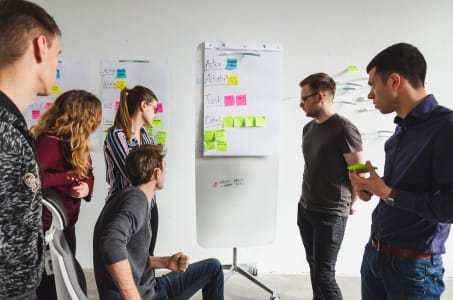
To make it plain, simple and efficient we start every product with kickoff workshops where stakeholders explain goals to the entire team. In our case, everyone was invited: designers, software developers, content writers, QA engineer, and the meeting was led by a scrum master.
We use workshops to:
- Explain business goals to the team.
- Discuss the general shape of the website, its functionalities.
- Design the first wireframe if possible (in this case, it was a quite simple website and that was achievable).
- Create the backlog, share the workload and let the team members assign their first tasks.
What were the results of our workshop?
The design backlog was divided and built around two main focuses: UI/UX of the page, and the animations and interactions on the page. Claudia, the Product Designer took the lead on the UI/UX goal, and Piotr, Creative Designer, focused on the animations. The goal of this move was to make the best use of the skills of our designers in their specific areas of expertise. Following the agreed process, each of the designers prepared their own design proposal. After a short and very creative confrontation between these two different approaches, they decided on the final look for the landing page. Thanks to this mixed approach, the website gained its unique character and design.
In the next step, our designers divided the initial wireframe into specific sections and worked on their designs iteratively.
As a result, they created a coherent and consistent design for a functional but eye-catching website. The work was done mainly in Sketch, and files stored on Dropbox. Claudia and Piotr were in constant contact with each other to discuss details or simply share their inspirations. Despite working from different cities - Katowice and Gdańsk are 460 km (285 miles) apart - they were very happy with the quality and results of this collaboration.
The website’s copy and its voice and tone was also discussed at the workshops. Paweł, the content writer, created the first version of the copy based on the first version of the wireframe. Later the copy was adjusted to each design iteration, making sure it remained coherent with the website’s goals and intended look. After this step, Kamil, our UX copywriter added microcopy. During the process, the whole content was getting feedback at every step of the product development. Paweł and Kamil are located in cities that are 220 km (137 miles) apart from each other.

What makes our process quite special is that at Boldare everyone can feedback on everyone’s work. A content writer comments on the work of a designer, and designers can feedback on software developer’s work, and the other way around. This way we are sure that every single piece of the website is aligned to its goals.
5. Put emphasis on communication between team members
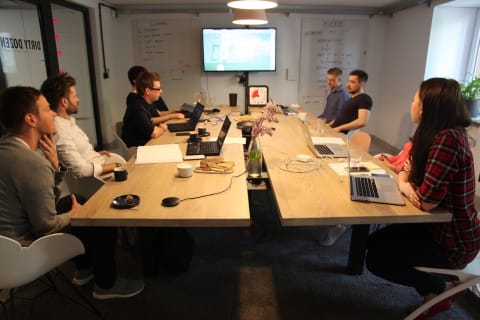
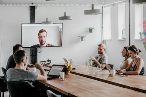
Especially when the work is done by remote and distributed teams. The more they exchange their thoughts, the better the results will be. We try to work under the “over-communication is better than under-communication” rule. As you probably noticed, all of our team members were located in various cities, in their homes. If the team uses the proper tools, works using full transparency and respects the process, the distance between them is not important at all.
During the whole process of designing award-winning websites, our designers and developers were using Slack to chat and make quick calls, and Google Meet for a daily scrum meeting with the rest of the team. Thanks to quick calls that were used to answer questions and solve problems, and open chat (we don’t use private messaging in our communication at all) communication was simple and efficient.
6. Testing is important
Especially if you work on something that will be immediately released into the hands of users. It helps to eliminate most of the potential problems - this is crucial also for commercial products.
For us, one of the final steps before launching the website was hallway testing. We gathered a group of 5 of Boldare’s designers and scrum masters and planned personal, 1 to 1 sessions so they could play with the website. Their main tasks were to:
- scroll down the whole page,
- execute some simple tasks,
- answer some questions regarding their feelings toward the website.
Thanks to that, we were able to catch some bugs and omissions that could potentially influence the Awwwards user ratings. We also gathered great feedback which really gave us a positive boost!
It was really great to see faces of our colleagues when they launched the landing page for the first time. It was truly priceless!, says Claudia.

7. Rely on transparency
It’s crucial when collaborating with remote and dispersed teams. Let the team use the main communication channels to ask questions and solve their problems, instead of private messages. This way everyone will be aware of what’s going on and the current status.
8. Use scrum and be agile
Scrum helps to organize work on a daily basis and allows us to deliver results in iterations, part by part. An agile mindset helps, working asynchronously, and adjusting goals to the changing situation. Both aspects are equally important for software development in general, not only for website creation.
9. Let the specialist decide
This is a very important lesson for all of the stakeholders or product owners who like to keep an eye on everything. Stop doing that! Make sure that the team understands the business goals and they know why they’re doing it. And then let them do it. They’re experts and they know how to do their job!
We approached the task of quickly releasing Boldare Boards landing page, knowing that our major goal is to win as many design awards as possible, aiming for an Honorable Mention from Awwwards as our first target. To get to this point, after kick-off workshops where we created the initial wireframe, we decided to say a big, fat YES to the brutalistic style of design.
We bet on this quite avant-garde approach despite rather the current minimalistic trends in contemporary web design. Product landing pages have become very predictable over the past few years. They follow similar design patterns both from the UX and UI perspectives. In choosing a brutalistic style and combining it with surprising functionalities, we wanted to grab the attention of our target persona for the product, and to get noticed by the Awwwards’ jury and the designer community.
For this particular project, we wanted to be rebellious, go outside our own comfort zone and stop focusing so much on being well-behaved and accurate, says Claudia, Product Designer. It’s supposed to be cheerful (but not childish!), playful and welcoming. To highlight this approach we hid a couple of easter eggs on the page - I encourage all to try to find all of the interactions! At the same time, we wanted to keep the Boldare brand and spirit visible, because it is quite unconventional and fitted into our ideas perfectly, she adds.
We wanted to create this landing page based on a retro-style, using a pastel palette of colors that refers to the UI design we used in the Boldare Boards tool. The monochromatic screen we utilized as a “hero” picture was setting the scene and made the context pretty clear from the beginning, adds Piotr, Boldare’s Creative Designer.
10. Choose technology wisely
We decided to create the whole landing page using the Vue.js framework. We chose it because it’s small, compared to other solutions, and websites built using this library are lightweight and load very fast with a generally very high performance.
Tomasz and Krzysztof, our frontend developers, decided to use the newest version of Vue.js - 3.0. While it’s not very common yet and there are few projects that have used it so far, they wanted to learn it and transfer their knowledge to the rest of the organization and colleagues. The framework is developing very quickly, so we see here an extra benefit that comes from knowing its newest version in practice.

Besides that, we utilized two other important libraries:
- GSAP 3.4.2 library that helped us to implement designed animations seamlessly.
- Matter.js 0.14.2 library allows users to generate and interact with the shapes that are present on the landing page.
The newest GSAP version allowed us to create timelines for the animations we used. Thanks to that, we could programme the exact moments when animations should appear on the screen, depending on the user’s behaviour, says Tomasz Góral, frontend developer.
Another important library was Matter.js, a 2D rigid body physics engine written in JavaScript.
Matter.js helped us simulate 2D physics in the browser and create rigid bodies with physical properties like mass or density. We also used this library to simulate collisions and gravity in parts of the website where users can play with the blocks, says Krzysztof.
Tomasz and Krzysztof work in cities that are 160km (100 miles) apart.
Final thoughts
As you can see, having the whole recipe won’t make the process any easier - unfortunately. You need to have a whole set of unique ingredients: talented specialists working as a trustworthy team, fine-tuned processes and quite a big pinch of freedom that allows designers to go far beyond well-worn patterns. Even so, I hope that this article shed some light on the process of creating great digital products using cross-functional agile teams within a limited timeframe. If you will need any help with your own products - let us know!
Share this article:


